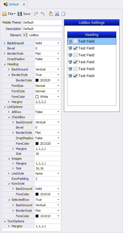
Themes: ListBox

This sets the themes for the ListBox control.
AlternateItem - Display alternate rows or columns using different colors. True turns on BackGround Colors 1 and 2; False keeps them same.
Heading – sets the theme for list box header.
Align – sets the heading’s alignment for the.
BackColor, BackColorAlt, BackStyle, Bevel, BorderColor, and BorderStyle are applied the same as in other examples.
FontSize, FontStyle, and ForeColor are applied the same as in other examples.
Height – sets the ListBox Heading’s height in pixels.
Visible –True display the heading; False hides it.
LineColor – the color of the lines within the grid if they are shown.
ListStyle – will hide or show the lines between rows and columns. None hides all the lines; Horizontal displays the lines between rows; Vertical displays the lines between columns; and Both displays lines between rows and columns
Row Selector – sets the coloring and styling of a selected row.
BackColor, BackColorAlt, BackStyle, Bevel, and ForeColor are applied the same as in other examples.
Transparency – sets the degree of transparency in a selected row.
Visibility – enables row selection (True); disables it (False)
Row Style – sets the theme for row elements
AltBackColor – sets the primary background color of a row when UseAltColors is True.
AltForeColor – sets the primary foreground color of a row when UseAltColors is True.
Padding – sets the row height in pixels for the List Box.
UseAltColors – Enables rows to use alternating colors (True); disables it (False).
ScrollBars – set to None, Horizontal, Vertical or Both to have the List Box and MenuList controls show or hide the default scrollbar. This is only the default and can be overwritten in the form design.
For property descriptions, see Graphical Control Properties.